Thursday, December 3, 2009
My Choice
This photo is a part of my Sutro Baths series. It is of the stairs leading up to the parking lot, which is a simple scene, but the complementary colors and space created from the angle of the shot make it interesting and pleasing to the eye. The size and length of the stairs as well as the angle of the shot makes the woman at the top look miniscule, which is an example of proportion, or more accurately, disproportion.
Photoshop Altered Image
This photo, too, was taken at Sutro Baths in San Francisco. I like it because it is altered to look like gold chunks sitting at the mouth of a tunnel, when in reality, the gold chunks are rocks. The texture of the rocks brings dimension to the photo and makes it interesting. The emphasis of the rocks, the writing in the tunnel, and the different details of the photo really pop. The rocks are unified because obviously, they are all rocks. This photo is obviously altered, and the changes make you notice things you wouldn't normally notice.
Photo in the Style of Diane Arbus - Receiving
This photo was taken on the streets of Seattle, Washington. We were giving a jug of milk to a homeless man when I captured this image. Although I do not know this man well, I can guess that he doesn't smile like he does in this photo very often. There is a story behind this image, and in a way, it is an environmental portrait. It makes me happy that I made someone smile in the course of my work. This image also has good composition because of the value, which emphasizes the emotion, happiness, in this image. This image has balance because it is asymmetrical, and the subject of this portrait is emphasized.
Actor Headshot - Nancy Pometta - Angry
This is a headshot for an actor, Nancy Pometta, depicting her being angry. This image is a great example of value because of the high contrast and the fact that it is black and white. Emphasis on the emotion in her face is a prevalent principle. Her zoomed face makes the viewer focus only one her, not on the background.
Environmental Portrait- Boudin's Baker
This photo was taken at Boudin's Bakery in San Francisco. It was a rather quick shot because I had a very short time to capture the spectacle, the giant alligator made of delicious sourdough bread! There is a sense of movement and rhythm because the line of the alligator moves your eye along the photo. Pattern is also created by the consistent "scales" of the alligator's back, and the texture of the scales is pleasing to the eye. However, this is an environmental portrait of the baker because he is in his element with his dough, in his uniform, and holding and admiring his work.
Tuesday, December 1, 2009
Self Portrait
The object of this photo project was to create a self portrait that utilizes design elements and principles as well as reveals something about ourselves. This image uses the element of shape and form because my figure is accentuated. The principle of balance is used because of the asymmetry of my head. This image reveals through the editing that I love color, and the setting discreetly provokes curiosity and reveals that I am a rower.
Scanner Art
Monday, November 30, 2009
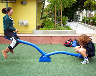
Shutter Photo
This photo was captured in a park. The bright colors of the subjects and setting add to the fun and happiness know to be associated with parks. Balance is created by the asymmetry of the image (the teeter totter being up and down), and it is a shutter photo, as it captures a moment in time, noting a fairly fast shutter.
Tuesday, November 24, 2009
Ansel Adams Nature Photography
This image taken at Sutro Baths, San Francisco follows the style of famous photographer Ansel Adams. The wave hitting the rocks is a moment in time captured to create a sense of movement. Also, the naturistic sense is captured by the outdoor setting. The black and white, a characteristic of Adams' work, creates a sense of value too.
Value
Variety
This image, though simple, represents the principle of variety. The element line is also a factor in the photo's composition, but the difference of big and small, intact and dilapidated, is far more prevalent. Opposites make this photo meaningful and interesting. It is not just something to look at; it makes you think.
Friday, November 20, 2009
Sunprint
This is an edited sunprint image. The concept was to create a clear silhouette of arranged objects, and then to edit them to create a "crazy" effect. This image has a combination of filters to create a collage of different effects. Balance is created with the halved color scheme, and shape is a major design element, as the silhouettes are the only artistic forms visible, aside from the colors and textures.
Subscribe to:
Posts (Atom)