Search This Blog

Tuesday, April 27, 2010

Ad Council


My Ad Council topic was Youth Reckless Driving Prevention. I took photos of cars going over the speed limit, about to crash, and teens in cars, having fun. I did this to go with my slogan, "There's no limit to safety." I made the text stand out brightly on darker backgrounds, going with the slant of an object in the photo or having a flow to go with the sky. The photos all have some sky in the background which gives them dimension and goes with the "no limit" idea. In this photo, space and movement are the principles used.
Monday, March 29, 2010

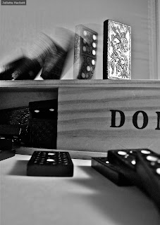
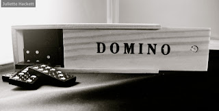
Toy Portrait


These are portraits of dominos. One is more of a product shot, while the other shows the dominoes in action, falling down. They are in black and white to draw the focus to the product. Also, the dominoes are black and white anyway, so grayscale is appropriate, and it adds value.

Tuesday, March 23, 2010

Narrative Still Life


This photo is supposed to narrate my dad's life, which essentially consists of reading, drinking coffee, and watching television, among other things. I edited the image in photoshop to make it more dramatic. I burned the edges to create more shadowing and emphasis on the subject.

Friday, March 19, 2010

Bathroom


This is a commercial-type image of a bathroom product. A certain viewpoint was used to emphasize the product. Texture was also used to contrast the product with the background.

Kitchen


These are abstract images of common kitchen utensils. They are against neutral backgrounds. The first uses light reflections for value and the second uses shape and form.

Friday, March 12, 2010

Surrealist Image


This image is a surrealist image, originally consisting of a landscape photo of the ocean and a photo of a giraffe. I removed the giraffe from its original background and inserted it into the other photo to create a surreal effect of a giraffe walking on the ocean.

Warhol Quad Print


The original photo used in this print was a closeup of a kangaroo at the San Francisco Zoo. I used Photoshop to create a quad, pop art effect in the style of Andy Warhol. The colors are used for emphasis, and there is unity in the theme and composition of all four images.

Wednesday, March 10, 2010

Pet Portrait


This is a photo of a dog and its owner taken at the beach. The owner-pet relationship is portrayed as a good friendship because their minds are in different places but they are still bonded together. The composition is interesting because the dog is behind the other subject, the owner, looking right at the camera. The man is placed off center for balance in the image. I also think the man's sunburn and tattoos are an interesting demonstration of a beach-goer. In a sense, unity and variety are incorporated into this image.

Thursday, March 4, 2010

Zoo-Silkscreen


This is a silkscreen of a photo of a flamingo at the San Francisco Zoo. The original photo was altered in photoshop to make the pinks stand out over the normal black and white value. This photo is a portrait of the flamingo, altered to create a fantasy portrayal of it, in a style similar to that of Andy Warhol.
I did the process in two similar but different ways.

Zoo-Environmental


These are environmental portraits of a giraffe and a grizzly bear at the San Francisco Zoo. The shape of the giraffe's neck shows shape and form, and the placement of the grizzly bear's placement in the photo shows balance (Rule of Thirds). The giraffe's environment shows that it is not in the wild, but fenced in in a civilized area, eating bark off a tree.. The grizzly bear appears to be in the wild, as shown by the rocks and grass, but a bit of fence is still visible.

Zoo-Formal


This is a photo of a mandrill at the San Francisco Zoo, in the form of a formal portrait. I like that he is looking right at the camera, making eye contact like a human would.

Thursday, February 18, 2010

Polar Distortion


This is an image of rocks on the water, edited in Photoshop.
Square Image
Filter>Distort>Polar Coordinates

Wednesday, February 17, 2010

Texture


These photos are detailed nature shots created to emphasize the element of texture. They also utilize the elements of color, emphasis and balance through the Rule of Thirds and contrasting subjects and backgrounds.

Tuesday, February 16, 2010

Great Landscape


This image has balance because of the asymmetry of the cliff and the trees. The Rule of Thirds is also used because of the trees on the line intersection and the convergance of the two halves of the image. Bright colors are also used to emphasize the textures of the cliff and trees.

Friday, February 5, 2010

6 Image Photo Essay - Accidental Smileys


This is a photo of a character from an Asian language. It is more obviously a smiley face, but the element of looking at something in two ways is still present.

6 Image Photo Essay - Accidental Smileys


These images are part of a photo essay documenting accidental faces I saw in my home, at school, and in other places. They are close ups, and they are related in theme. Balance is used in most of the images because of the symmetry or asymmetry of the faces. Also, shape is used to distinguish the parts of the images that make up the faces.

Monday, February 1, 2010

Chapel


This is a photo of wooden bars blocking a confessional booth-turned-storage room. The shadows promote emphasis and the repetition of the bars shows line and pattern. Overall, this image is an abstract close-up of architecture. It shows the details of the woodwork and promotes the beauty of the chapel.

Tuesday, January 26, 2010

Stop Motion Video


This is a stop motion series of the progression of a burrito being eaten. I was actually eating eat when these photos were taken. I would take a bite and shoot, and it took about 35 photos to get the entire sequence.

Friday, January 22, 2010

Mercy Street


This image was taken in a study center. The comfortable stance of the student symbolizes the comfortable atmosphere of Mercy. The position of the subject create asymmetry (balance).

Sunday, January 10, 2010

Action Photograph


This photo was taken in the middle of a kickball game. The subject is the pitcher, and he is in mid-throw. The goal of this image was to create a freeze effect by stopping motion. The Rule of Thirds was used to add to the effect of the pending throwing motion. Since the subject is moving toward the center of the frame, the feeling of movement is created. The rather bland background gives the spotlight to the subject, but the texture of the grass keeps the feeling of being in the outdoors and playing a real game.